Commit Graph

28 Commits

Author SHA1 Message Date
silverwind 5556782ebe
Forbid deprecated `break-word` in CSS (#30934)
Forbid
[deprecated](https://drafts.csswg.org/css-text-3/#word-break-property)
`break-word` and fix all occurences.

Regarding `overflow-wrap: break-word` vs `overflow-wrap: anywhere`:

Example of difference: https://jsfiddle.net/silverwind/1va6972r/

[Here](https://stackoverflow.com/questions/77651244) it says:

> The differences between normal, break-word and anywhere are only clear
if you are using width: min-content on the element containing the text,
and you also set a max-width. A pretty rare scenario.

I don't think this difference will make any practical impact as we are
not hitting this rare scenario.
2024-05-10 12:25:49 +00:00
silverwind ec3d467f15
Migrate `gt-hidden` to `tw-hidden` (#30046)
We have to define this one in helpers.css because tailwind only
generates a single class but certain things rely on this being
double-class. Command ran:

```sh
perl -p -i -e 's#gt-hidden#tw-hidden#g' web_src/js/**/* templates/**/* models/**/* web_src/css/**/*

---------

Co-authored-by: wxiaoguang <wxiaoguang@gmail.com>
2024-03-24 18:23:38 +00:00
silverwind 256a1eeb9a
Add `<overflow-menu>`, rename webcomponents (#29400)
1. Add `<overflow-menu>` web component
2. Rename `<gitea-origin-url>` to `<origin-url>` and make filenames
match.

<img width="439" alt="image"
src="https://github.com/go-gitea/gitea/assets/115237/2fbe4ca4-110b-4ad2-8e17-c1e116ccbd74">

<img width="444" alt="Screenshot 2024-03-02 at 21 36 52"
src="https://github.com/go-gitea/gitea/assets/115237/aa8f786e-dc8c-4030-b12d-7cfb74bdfd6e">

<img width="537" alt="Screenshot 2024-03-03 at 03 05 06"
src="https://github.com/go-gitea/gitea/assets/115237/fddd50aa-adf1-4b4b-bd7f-caf30c7b2245">


![image](https://github.com/go-gitea/gitea/assets/115237/0f43770c-834c-4a05-8e3d-d30eb8653786)


![image](https://github.com/go-gitea/gitea/assets/115237/4b4c6bd7-843f-4f49-808f-6b3aed5e9f9a)

TODO:

- [x] Check if removal of `requestAnimationFrame` is possible to avoid
flash of content. Likely needs a `MutationObserver`.
- [x] Hide tippy when button is removed from DOM.
- [x] ~~Implement right-aligned items
(https://github.com/go-gitea/gitea/pull/28976)~~. Not going to do it.
- [x] Clean up CSS so base element has no background and add background
via tailwind instead.
- [x] Use it for org and user page.

---------

Co-authored-by: Giteabot <teabot@gitea.io>
Co-authored-by: wxiaoguang <wxiaoguang@gmail.com>
2024-03-15 02:05:31 +00:00
silverwind dc52f26d46
Reduce margin/padding on flex-list items and divider (#27872)
Small CSS tweak, reduces margin/padding from 14px to 10px, which I think
looks better
2023-11-02 12:30:38 +08:00
silverwind 83f571628d
Feed UI Improvements (#27356)
Various improvements related to feeds:

- Fix markdown rendering
- Increase font size from 13px to default 14px via `flex-item`
- Add style to hashes
- Move the timestamp to title line. I realize it's not optimal for
translation, we may need to change all these translations

Before:
<img width="768" alt="Screenshot 2023-09-29 at 22 52 58"
src="https://github.com/go-gitea/gitea/assets/115237/edda8b84-23cf-4a43-90ad-a892798f4e6c">

After:
<img width="781" alt="Screenshot 2023-09-29 at 22 58 09"
src="https://github.com/go-gitea/gitea/assets/115237/7097474d-efcf-4f22-a2ab-834a4e25c4e8">
2023-09-30 15:48:34 +00:00
wxiaoguang 58abd4f06c
Improve issue list layout (#26983)
Align everything with a new layout.

* Use "baseline" for some special elements, the "flex-item-icon" is for
the issue list only at the moment and I think it should be general
enough now (but not using "flex-item-leading" anymore in this case).
* Make the labels stretch themselves.
2023-09-09 20:23:57 +08:00
wxiaoguang ffa4949eaa
Improve flex list UI (#26970)
1. There is already `gt-ac`, so no need to introduce `flex-item-center`
2. The `flex-item-baseline` and `.flex-item-icon svg { margin-top: 1px
}` seem to be a tricky patch, they don't resolve the root problem, and
still cause misalignment in some cases.
* The root problem is: the "icon" needs to align with the sibling
"title"
    * So, make the "icon" and the "title" both have the same height 
3. `flex-text-inline` could only be used if the element is really
"inline", otherwise its `vertical-align` would make the box size change.
In most cases, `flex-text-block` is good enough.


![image](https://github.com/go-gitea/gitea/assets/2114189/1b7acfc2-b1c7-4e9c-a983-2fa932026479)

---------

Co-authored-by: silverwind <me@silverwind.io>
Co-authored-by: Giteabot <teabot@gitea.io>
2023-09-08 13:57:18 +00:00
wxiaoguang 419003adb2
Improve SSH Key / GPG Key / Deploy Key UI (#26949)
1. In many cases, the `flex-list` has previous and next `gt-hidden`
siblings, so relax the CSS selector to remove all ".segument .flex-list"
paddings.
2. Make the "Add key" button can toggle
3. Move help message into the related segment(panel). Otherwise users
would misread the message, eg: the SSH help seemed for GPG because they
are so near
4. Move modal element into the segment element, otherwise it affects the
layout
2023-09-07 01:13:11 +00:00
silverwind 9b76df53dc
Minor dashboard tweaks, fix flex-list margins (#26829)
Some small dashboard tweaks:

- Remove margin-bottom from divider so first item does not appear to
have un-equal margins
- Restore previous icon color
- Add slight margin-right to icon

Before:
<img width="783" alt="Screenshot 2023-08-31 at 00 10 28"
src="https://github.com/go-gitea/gitea/assets/115237/b75f70d7-8704-4afb-866d-fea0484c52d4">

After:
<img width="783" alt="Screenshot 2023-08-31 at 00 10 08"
src="https://github.com/go-gitea/gitea/assets/115237/50ed0c47-6f7c-449e-a054-13091369d43f">

---------

Co-authored-by: wxiaoguang <wxiaoguang@gmail.com>
2023-08-31 21:28:45 +00:00
wxiaoguang 1a9998ce91
Improve flex list item padding (#26779)
Replace #26761

It's better to keep children elements simple, and let parent containers
layout the necessary padding/margin.

The old `not(:last-child)` and `.flex-item + .flex-item` are not easy to
maintain (for example, what if the developer would like to use a "tiny
height" item?)

The old approach also makes some UI look strange because the first item
doesn't have proper padding-top.

In this PR, we just simply use `.flex-item { padding: ... }`:

* Developers could manually set the item height they want easily
* It's easier to make it work with various containers -- with padding
(`ui segment`) and without padding (`div`)

And added more samples/examples.


![image](https://github.com/go-gitea/gitea/assets/2114189/719ea712-0241-4426-b67f-5723993c4ed7)

Co-authored-by: Giteabot <teabot@gitea.io>
2023-08-29 23:13:30 +00:00
wxiaoguang e4b2bdfbc0
More improvements for the "flex list" and the dashboard list (#26675)
Follow #26649 and #25790 and add one more example (text truncate) in the devtest page
2023-08-23 04:23:30 +00:00
wxiaoguang 7934602a4c
Improve some flex layouts (#26649)
Fix #26617

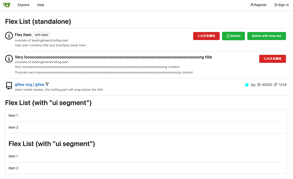
1. Separate the "flex-list" examples into a dedicated template, and add some more examples
2. Use `flex-basis` instead of `flex-shrink` for `flex-item-trailing`, to avoid wrapping the texts too aggressively
3. Some `flex-wrap: wrap;` are removed
2023-08-22 12:57:02 +08:00
Denys Konovalov b9baed2c74
Introduce `flex-list` & `flex-item` elements for Gitea UI (#25790)
This PR introduces a new UI element type for Gitea called `flex-item`.
It consists of a horizontal card with a leading, main and trailing part:


![grafik](https://github.com/go-gitea/gitea/assets/47871822/395dd3f3-3906-4481-8f65-be6ac0acbe03)

The idea behind it is that in Gitea UI, we have many cases where we use
this kind of layout, but it is achieved in many different ways:
  - grid layout
  - `.ui.list` with additional hacky flexbox
- `.ui.key.list` - looks to me like a style set originally created for
ssh/gpg key list, was used in many other places
  - `.issue.list` - created for issue cards, used in many other places
  - ...

This new style is based on `.issue.list`, specifically the refactoring
of it done in #25750.

In this PR, the new element is introduced and lots of templates are
being refactored to use that style. This allows to remove a lot of
page-specific css, makes many of the elements responsive or simply
provides a cleaner/better-looking way to present information.

A devtest section with the new style is also available.

<details>
<summary>Screenshots (left: before, right: after)</summary>

![Bildschirmfoto vom 2023-07-09
21-01-21](https://github.com/go-gitea/gitea/assets/47871822/545b7da5-b300-475f-bd6d-b7d836950bb5)
![Bildschirmfoto vom 2023-07-09
21-01-56](https://github.com/go-gitea/gitea/assets/47871822/b6f70415-6795-4f71-a5ea-117d56107ea1)
![Bildschirmfoto vom 2023-07-09
21-02-45](https://github.com/go-gitea/gitea/assets/47871822/47407121-3f2a-4778-8f6d-ad2687c2e7b3)
![Bildschirmfoto vom 2023-07-09
21-03-44](https://github.com/go-gitea/gitea/assets/47871822/76167aaf-c3b2-46f6-9ffd-709f20aa6a34)
![Bildschirmfoto vom 2023-07-09
21-04-52](https://github.com/go-gitea/gitea/assets/47871822/af8fdde5-711e-4524-99cf-fb5d68af85b9)
![Bildschirmfoto vom 2023-07-09
21-05-25](https://github.com/go-gitea/gitea/assets/47871822/ae406946-e3e4-4109-abfe-b3588a07b468)
![Bildschirmfoto vom 2023-07-09
21-06-35](https://github.com/go-gitea/gitea/assets/47871822/2dbacc04-24d6-4f91-9e42-e16d6e4b5f1f)
![Bildschirmfoto vom 2023-07-09
21-09-03](https://github.com/go-gitea/gitea/assets/47871822/d3ca4e56-a72f-4179-adc8-98bfd638025b)
![Bildschirmfoto vom 2023-07-09
21-09-44](https://github.com/go-gitea/gitea/assets/47871822/df1fa689-499c-4e54-b6fb-3b81644b725f)
![Bildschirmfoto vom 2023-07-09
21-10-27](https://github.com/go-gitea/gitea/assets/47871822/b21cac71-a85a-4c8c-bb99-ab90373d8e09)
![Bildschirmfoto vom 2023-07-09
21-11-12](https://github.com/go-gitea/gitea/assets/47871822/89be39cf-0af9-4f2d-9fca-42f9eb5e7824)
![Bildschirmfoto vom 2023-07-09
21-12-01](https://github.com/go-gitea/gitea/assets/47871822/079579ea-1ecb-49c0-b32b-b59ed957caec)
![Bildschirmfoto vom 2023-07-09
21-17-44](https://github.com/go-gitea/gitea/assets/47871822/61ac6ec4-a319-4d5c-9c99-2e02a77295ba)
![Bildschirmfoto vom 2023-07-09
21-18-27](https://github.com/go-gitea/gitea/assets/47871822/5b55b73f-6244-47f7-a3e6-c5e4a7474585)
![Bildschirmfoto vom 2023-07-09
21-19-18](https://github.com/go-gitea/gitea/assets/47871822/c1b7c22e-3e5a-46d4-b8d6-5560db478c0b)
![Bildschirmfoto vom 2023-07-09
21-29-13](https://github.com/go-gitea/gitea/assets/47871822/82ffca8d-ab2e-4a18-9954-5b685bf6a422)
![Bildschirmfoto vom 2023-07-09
21-30-11](https://github.com/go-gitea/gitea/assets/47871822/ad2fdccc-2be8-41bb-bfdc-a084aa387b61)
![Bildschirmfoto vom 2023-07-09
21-32-44](https://github.com/go-gitea/gitea/assets/47871822/2d298ba7-d084-48b5-a139-f86d56262110)
![Bildschirmfoto vom 2023-07-09
21-33-28](https://github.com/go-gitea/gitea/assets/47871822/4cbd838e-9de8-4ad0-8ed9-438da5c9a5cb)


</details>

---------

Co-authored-by: Giteabot <teabot@gitea.io>
2023-08-01 00:13:42 +02:00
Denys Konovalov be23b73e85
Restructure issue list template, styles (#25750)
This PR does various modifications on the issue list shared template:
- restructure layout to achieve better responsiveness
-  fix various style issues
- restructure styles (better result with less code :)
- remove numerous `gt-*` patches and other unneeded classes -> use
existing css classes

<details>
<summary>Before:</summary>

![Bildschirmfoto vom 2023-07-07
14-35-00](https://github.com/go-gitea/gitea/assets/47871822/5301fc80-d58b-41c2-8090-5867e2e8459c)
![Bildschirmfoto vom 2023-07-07
14-35-19](https://github.com/go-gitea/gitea/assets/47871822/d36ab691-7dc4-44bb-a8f6-a4105a2a6777)
![Bildschirmfoto vom 2023-07-07
14-35-43](https://github.com/go-gitea/gitea/assets/47871822/0762c852-eb40-4b00-8757-c5dbfd2ae569)
</details>

<details>
<summary>After:</summary>

![Bildschirmfoto vom 2023-07-07
14-32-04](https://github.com/go-gitea/gitea/assets/47871822/0ac42d36-f98f-451a-b556-70c913d19df8)
![Bildschirmfoto vom 2023-07-07
14-31-32](https://github.com/go-gitea/gitea/assets/47871822/520fac9c-33e3-4290-bfe1-6e941f1100f8)
![Bildschirmfoto vom 2023-07-07
14-31-14](https://github.com/go-gitea/gitea/assets/47871822/05ad46bb-3c67-403d-85b8-d12d64f99c59)

</details>

---------

Co-authored-by: silverwind <me@silverwind.io>
2023-07-09 19:38:01 +00:00
silverwind 0006169f38
Actions list enhancements (#25601)
Various small enhancements to the actions list. Before and after:

<img width="1264" alt="Screenshot 2023-06-30 at 00 11 40"
src="https://github.com/go-gitea/gitea/assets/115237/bb4162ee-cdcf-4a73-b05e-f9521562edbb">
<img width="1264" alt="Screenshot 2023-06-30 at 00 09 51"
src="https://github.com/go-gitea/gitea/assets/115237/52a70ea9-4bb3-406e-904b-0fdaafde9582">

---------

Co-authored-by: Giteabot <teabot@gitea.io>
2023-07-04 09:59:47 +00:00
silverwind 656d3cc719
Various UI fixes (#25264)
Numerous small UI fixes:

- Fix double border in collaborator list
- Fix system notice table background
- Mute links in repo and org lists
- Downsize projects edit buttons
- Improve milestones and project list rendering
- Condense milestone list entry to a single line of "metas"
- Mute ".." button in repo files list
2023-06-21 21:59:49 -04:00
Denys Konovalov 9e74063498
Fix UI on mobile view (#25315)
Various fixes to pages or elements which were looking ugly on mobile.
<details>
<summary>Screenshots</summary>

![Bildschirmfoto vom 2023-06-17
20-38-41](https://github.com/go-gitea/gitea/assets/47871822/30b5d3ce-df3b-43eb-a4c2-c3790667fb9d)
![Bildschirmfoto vom 2023-06-17
20-39-27](https://github.com/go-gitea/gitea/assets/47871822/27c07b25-3602-4fb2-b34d-d5e875e054e9)
![Bildschirmfoto vom 2023-06-17
20-41-27](https://github.com/go-gitea/gitea/assets/47871822/dacdbb4e-e3dd-4b94-abf0-c68e3d64bd3b)
![Bildschirmfoto vom 2023-06-17
20-41-48](https://github.com/go-gitea/gitea/assets/47871822/72432c35-7c4a-4c7f-a767-3562f26a5c14)
![Bildschirmfoto vom 2023-06-17
20-42-37](https://github.com/go-gitea/gitea/assets/47871822/737c26ed-1910-4467-98ef-e8769bbbe6f0)
![Bildschirmfoto vom 2023-06-17
20-42-52](https://github.com/go-gitea/gitea/assets/47871822/1813b4bc-43c0-4912-8acb-5d799c090bf3)
![Bildschirmfoto vom 2023-06-17
20-43-06](https://github.com/go-gitea/gitea/assets/47871822/136466e8-34e5-419d-97ec-5202ff819fd2)
![Bildschirmfoto vom 2023-06-17
20-43-42](https://github.com/go-gitea/gitea/assets/47871822/59270bb2-d661-4a84-8504-3e50f771f767)
![Bildschirmfoto vom 2023-06-17
20-44-44](https://github.com/go-gitea/gitea/assets/47871822/494e274d-3771-4141-9419-0a4bbd8b7f64)

</details>

Co-authored by @silverwind

---------

Co-authored-by: silverwind <me@silverwind.io>
2023-06-18 10:31:42 +00:00
silverwind 3ee8970419
add `stylelint-stylistic` (#25285)
Add
[stylelint-stylistic](https://github.com/elirasza/stylelint-stylistic),
autofix all issues with two manual tweaks. This restores all the
stylistic rules removed in Stylelint 15.
2023-06-17 13:20:32 +00:00
silverwind 623b3b590e
Button and color enhancements (#24989)
- Various corrections to button styles, especially secondary
- Remove focus highlight, it's annoying when it stays on button after
press
- Clearly define ghost and link buttons with demos in devtest
- Remove black, grey and tertiary buttons, they should not be used
- Make `arc-green` slightly darker

<img width="1226" alt="image"
src="https://github.com/go-gitea/gitea/assets/115237/8d89786a-01ab-40f8-ae5a-e17f40e35084">
<img width="1249" alt="image"
src="https://github.com/go-gitea/gitea/assets/115237/83651e6d-3c27-46ff-b8bd-ff344d70e949">

---------

Co-authored-by: wxiaoguang <wxiaoguang@gmail.com>
Co-authored-by: Giteabot <teabot@gitea.io>
2023-06-09 08:37:47 +00:00
HesterG 58536093b3
Add details summary for vertical menus in settings to allow toggling (#25098)
Close #25051
[referenced
answer](https://stackoverflow.com/questions/10813581/can-i-replace-the-expand-icon-of-the-details-element/69722686#69722686)
for marker overwrite. One limitation is that fomantic does not have
hover and active effects for the vertical submenu
([reference](https://fomantic-ui.com/collections/menu.html#sub-menu)).
And we might need to overwrite some styles if hover and active effects
are needed.

Update:
Used `data:image/svg` instead of `marker` content. And adjusted styles
for hover effect.

Take admin settings as an example:

https://github.com/go-gitea/gitea/assets/17645053/63f69823-ef43-47d5-a518-544b5ea35ba6

---------

Co-authored-by: silverwind <me@silverwind.io>
2023-06-07 10:49:48 +08:00
silverwind 19993d8814
Change `--font-weight-bold` to `--font-weight-semibold` and 600 value, introduce new font weight variables (#24827)
There was some recent discussion about this in Discord `ui-design`
channel and the conclusion was that
https://github.com/go-gitea/gitea/issues/24305 should have fixed their
OS font installation to have semibold weights.

I have now tested this 601 weight on a Windows 10 machine on Firefox
myself, and I immediately noticed that bold was excessivly bold and
rendering as 700 because browsers are biased towards bolder fonts. So
revert this back to the previous value.
2023-05-21 23:37:32 +00:00
silverwind b92c142c97
Clean up various avatar dimensions (#24701)
Clean up a few cases where avatar dimensions were overwritten via CSS,
which were no longer needed or were possible to set via HTML width.

Also included are two small fixes:

- Fix one more case of incorrect avatar offset on review timeline
- Vertically center avatars in review sidebar

There is more to be done here, but some of the work depends on Fomantic
`comment` module removal, or in the case of org member lists, a refactor
of the `avatarlink` template to accept a size.

<img width="371" alt="image"
src="https://github.com/go-gitea/gitea/assets/115237/9c5902fb-2b89-4a7d-a152-60e74c3b2c56">
<img width="306" alt="image"
src="https://github.com/go-gitea/gitea/assets/115237/c8d92e2a-91c9-4f4a-a7de-6ae1a6bc0479">

---------

Co-authored-by: Giteabot <teabot@gitea.io>
2023-05-14 14:15:59 +00:00
Hester Gong f1a4330306
Modify width of ui container, fine tune css for settings pages and org header (#24315)
Close #24302 
Part of #24229, Follows #24246
This PR focused on CSS style fine-tune, main changes:

1. Give `.ui.ui.ui.container` a width of `1280px` with a max-width of
`calc(100vw - 64px)`, so the main contents looks better on large
devices.

2. Share styles for table elements in all levels settings pages to fix
overflow of runners table on mobile and for consistency (The headers on
mobile can be further improved, but haven't found a proper way yet).

3. Use [stackable
grid](https://fomantic-ui.com/collections/grid.html#stackable) and
[device column width](https://fomantic-ui.com/examples/responsive.html)
for responsiveness for some pages (repo/org collaborators settings
pages, org teams related page)

4. Fixed #24302 by sharing label related CSS in reporg.css

5. Fine tune repo tags settings page

---------

Co-authored-by: wxiaoguang <wxiaoguang@gmail.com>
2023-04-26 11:59:08 -04:00
wxiaoguang 20a3b03fe5
Add --font-weight-bold and set previous bold to 601 (#24307)
Fix #24305

According to MDN, "bold" starts from 700, some fonts do not provide
"bolding" for weight 600

https://developer.mozilla.org/en-US/docs/Web/CSS/font-weight

---------

Co-authored-by: silverwind <me@silverwind.io>
Co-authored-by: Giteabot <teabot@gitea.io>
2023-04-24 13:46:00 -04:00
Hester Gong 6793ef0069
Use secondary pointing menu for tabs on user/organization home page (#24162)
Close #24108

Use secondary pointing menu for tabs on user/organization home page so
the tabs look the same.
Main changes:
1. modified a part of dom structure in
`templates/user/overview/header.tmpl` to make it the same as
`templates/org/header.tmpl` in order to produce the same ui.
2. Move some css to `web_src/css/shared/repoorgshared.css` to make them
shareable between `templates/user/overview/header.tmpl` and
`templates/org/header.tmpl`

After:


https://user-images.githubusercontent.com/17645053/232400617-2add5bec-d483-4ab1-b48d-eaee157f7b09.mov

For further improvements. Need some thoughts: 

For [this
TODO](729ad294cb/templates/user/overview/header.tmpl (L1)),
it is viable to make it a shared template for [this
part](729ad294cb/templates/user/overview/header.tmpl (L2-L17))
and [this
part](729ad294cb/templates/org/header.tmpl (L1-L16))
because they are the same except for the variable. But for the menu
parts, they are quite different so might not be suitable to use a shared
template. So need some thoughts and advice about extracting the shared
template from these two headers.

---------

Co-authored-by: Giteabot <teabot@gitea.io>
2023-04-20 04:58:26 -04:00
silverwind 525b7382d3
Convert issue list checkboxes to native (#23596)
Use native instead of fomantic checkboxes in issue list. Benefits
include no more JS pop-in on load and perfect a11y.

Before, with JS pop-in:

<img width="92" alt="Screenshot 2023-03-20 at 17 02 02"
src="https://user-images.githubusercontent.com/115237/226398955-99029a1c-1150-449c-821b-e4165e7446a8.png">

After, Firefox on macOS:

<img width="126" alt="Screenshot 2023-03-20 at 17 01 26"
src="https://user-images.githubusercontent.com/115237/226399018-58df2c32-c2b2-4c78-b7df-7b76523abe21.png">

After, Chrome on macOS:

<img width="79" alt="Screenshot 2023-03-20 at 17 01 42"
src="https://user-images.githubusercontent.com/115237/226399074-947e6279-8dc3-42c2-90b5-b106c471b23d.png">

I opted to not do styling yet but I see that the inconsistency between
browsers may already be reason enough on doing it. I think if we style
them, there should be one global style, including markdown ones which
currently have custom styling.
2023-03-30 11:02:47 -04:00
Hester Gong a9cceb0597
Fix long project name display in issue list and in related dropdown (#23653)
This PR is to fix the second problem mentioned in #23625, along with the
long texts problem in `issue-item-bottom-row` of `issuelist.tmpl`

Main changes are:
1. Add `max-width` to the search dropdowns in issue list and make the
possible long texts inside to show ellipsis if texts are long
2. Adjust the conditions in
[issuelist.tmpl](1d35fa0e78/templates/shared/issuelist.tmpl (L146-L167))
to fix the problem as mentioned by the
[comment](https://github.com/go-gitea/gitea/issues/23625#issuecomment-1479281060)
3. Use `word-break: break-word;` in `issue-item-bottom-row` to break the
possible long texts.

After the PR
issuelist in repo (similar for pr list):
<img width="366" alt="截屏2023-03-23 17 42 40"
src="https://user-images.githubusercontent.com/17645053/227163953-93e9adbd-5785-4c16-b538-9db901787775.png">

dropdowns with long name (Here take reference from github to deal with
the long names cases: show ellipsis with no title, because all these
options are clickable, and it might not be necessary to add titles to
them ):

<img width="370" alt="截屏2023-03-23 17 43 50"
src="https://user-images.githubusercontent.com/17645053/227164215-df6fcaaa-9fee-4256-a57c-053fbcffafbb.png">

<img width="365" alt="截屏2023-03-23 17 43 56"
src="https://user-images.githubusercontent.com/17645053/227164227-9c99abcd-f410-4e07-b5b8-cbce764eedcd.png">

issue page (similar for pr page):
<img width="374" alt="截屏2023-03-23 17 45 37"
src="https://user-images.githubusercontent.com/17645053/227164668-654a8188-dac8-4bbf-a6e3-f3768a644a1b.png">

on PC:
<img width="1412" alt="截屏2023-03-23 17 47 20"
src="https://user-images.githubusercontent.com/17645053/227166694-e7bcc6e5-9667-4cef-9fbf-db85640a2c6c.png">

<img width="1433" alt="截屏2023-03-23 17 46 40"
src="https://user-images.githubusercontent.com/17645053/227165182-4e2a5d19-74bc-4c66-b73c-23cbca176ffe.png">
2023-03-24 15:11:23 +08:00
silverwind 202803fc69
Replace Less with CSS (#23481)
Ran most of the Less files through the Less compiler and Prettier and
then followed up with a round of manual fixes.

The Less compiler had unfortunately stripped all `//` style comments
that I had to restore (It did preserve `/* */` comments). Other fixes
include duplicate selector removal which were revealed after the
transpilation and which weren't caught by stylelint before but now are.

Fixes: https://github.com/go-gitea/gitea/issues/15565
2023-03-14 22:20:19 -04:00